Our remote team at Fantasy is growing. We offer full-time consultant contracts and embrace you as a full-time Fantasy Team member
Read it
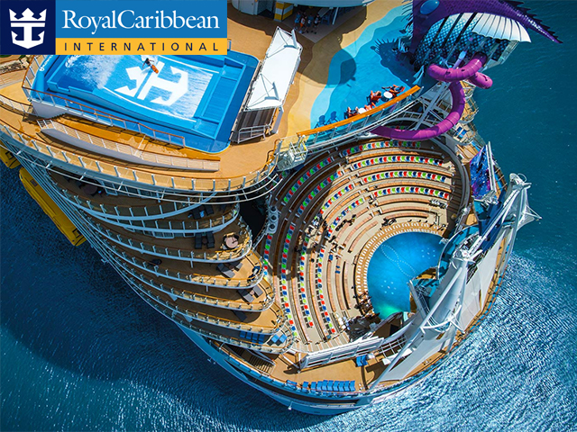
Royal Caribbean Cruise Lines selects Fantasy
Royal Caribbean Cruises Ltd. is an American global cruise company based in Miami, Florida.
Read it

OkCupid selects Fantasy
OkCupid, the substantive free online dating company has selected Fantasy as their product design partner.
Read it
Avon selects Fantasy
Avon, the American international manufacturer and direct selling company, has selected Fantasy
Read it
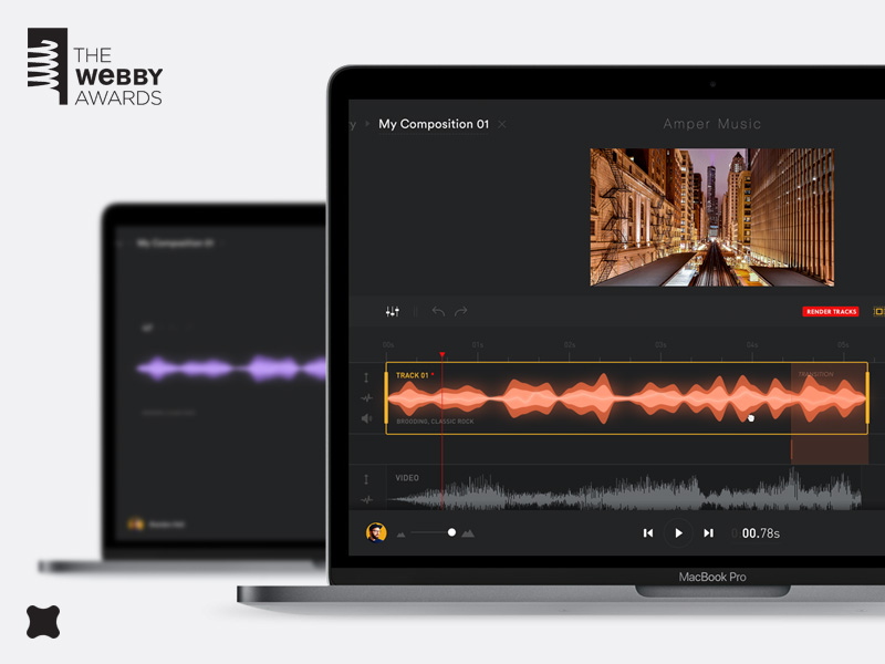
How we made Amper
Amper is an A.I composer, performer, and producer. It's a beautiful product we designed last year and it's up for a webby right now